The lawyers at Harris Trzaskoma LLP are among Manhattan’s most experienced and respected litigators and criminal defense specialists. They are routinely called upon to guide clients through complex legal challenges—in courtrooms, boardrooms, and conference rooms alike. Like Yellow, they are driven by a singular goal: achieving the best possible outcomes for their clients. Above all, Harris Trzaskoma seeks to communicate in a voice that is unmistakably its own—distinct, compelling, and true to its vision.
![]()

Logo
Website
Communication planning
Website
Communication planning

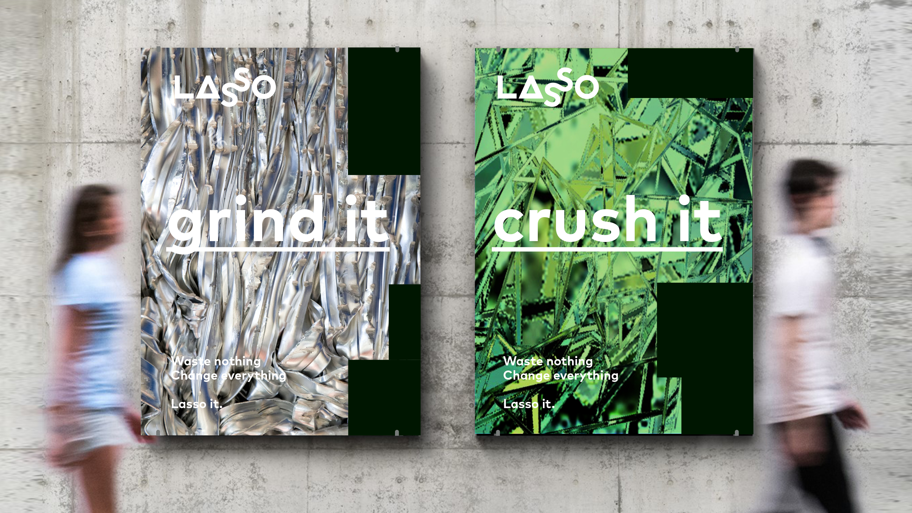
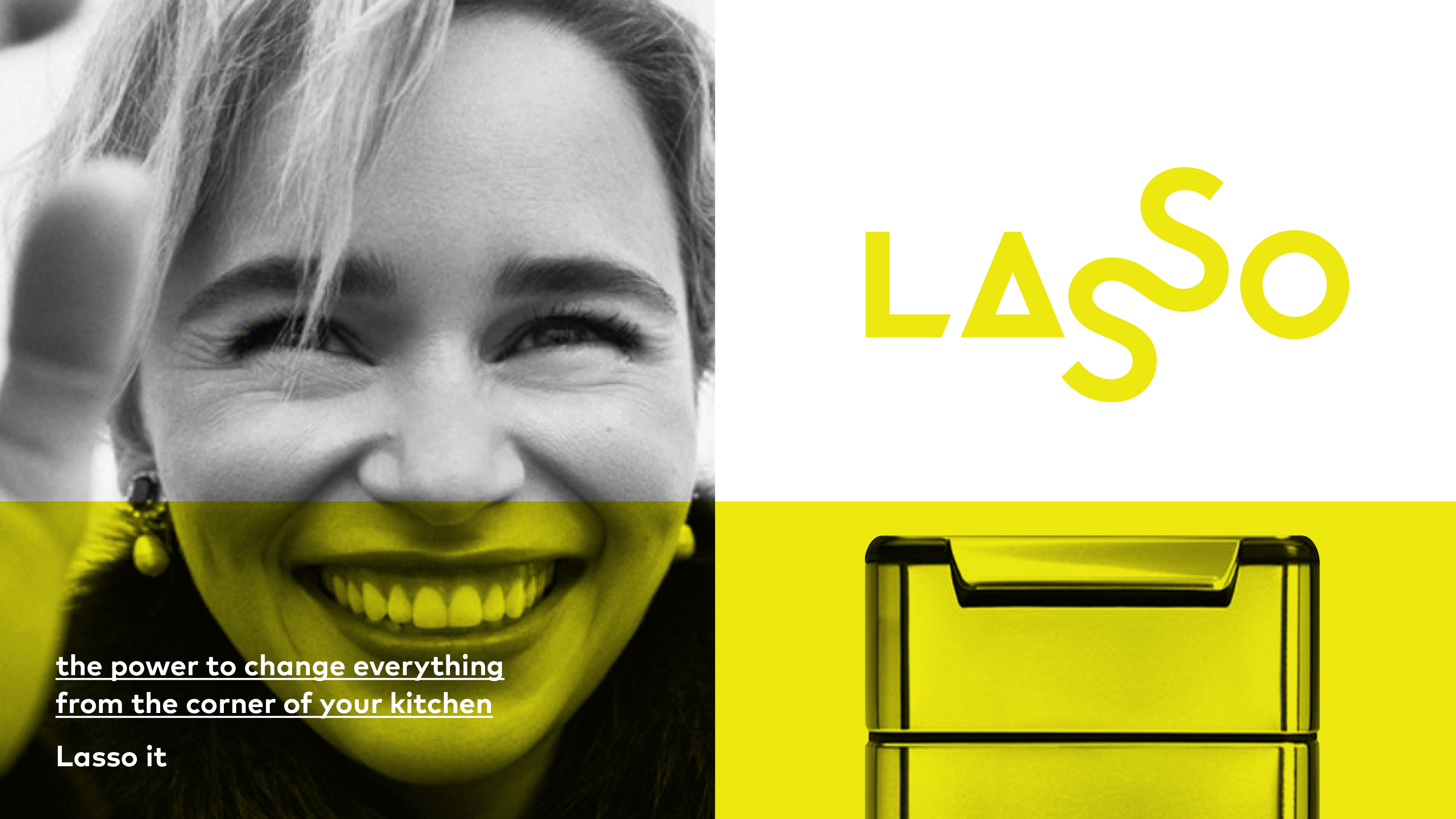
Yellow recently worked with Big Small (Ben Cleaver and Tom Evans) to brand the world’s first closed-loop recycling home appliance company. Every year, millions of tonnes of plastic,
glass and other useful materials are sent to landfill or dumped into rivers and
oceans. Co-founders Aldous Hicks and Alison Richardson thought there was a
better way, and they designed the Lasso system.
The team at Yellow created a visually compelling brandmark to cross all media — from device to app.
The team at Yellow created a visually compelling brandmark to cross all media — from device to app.
Brandmark
Brand system
Brand world
Brand toolkit
Brand system
Brand world
Brand toolkit


Flowers Keller are unapologetic former federal public defenders turned private practitioners specializing in high-end criminal defense and wrongful conviction work. They commissioned Yellow to craft a logo that radiates confidence clarity and purpose—and a website that showcases their expertise and experience. Above all they wanted a voice that is unmistakably their own: bold compelling and driven by their passion for justice.
Logo
Website
Communication planning
Website
Communication planning


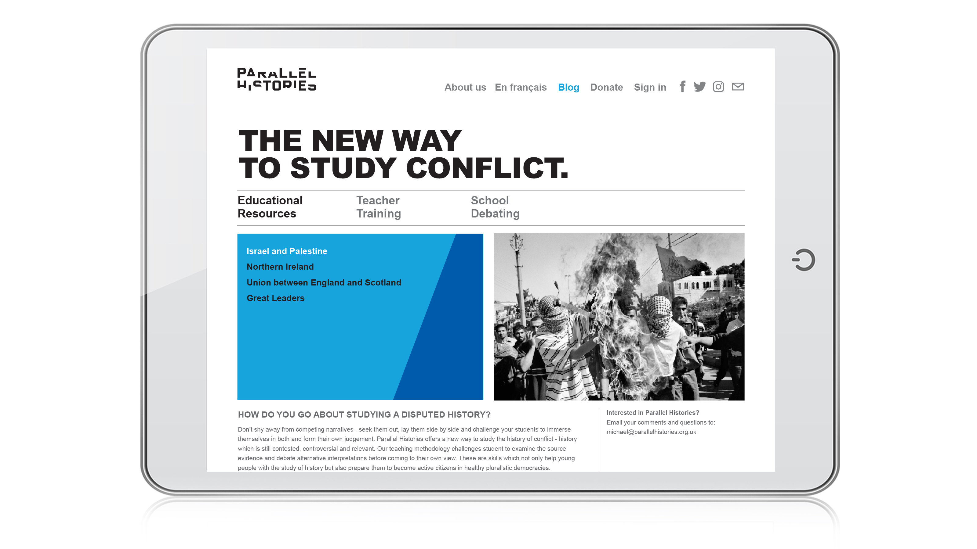
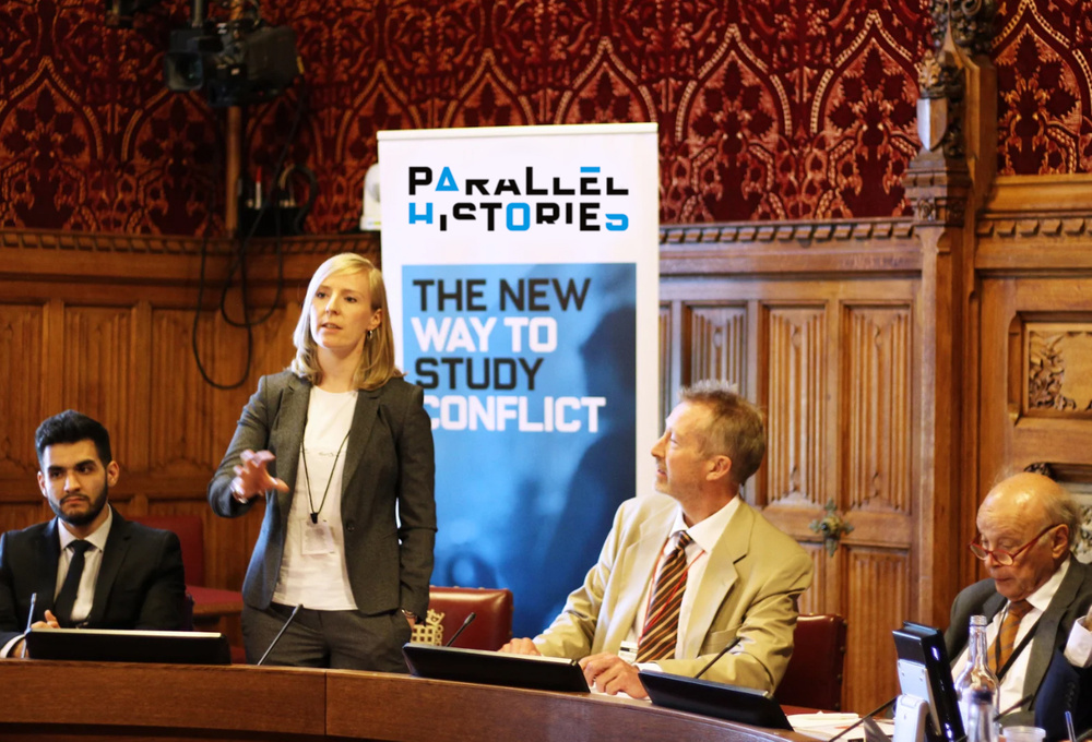
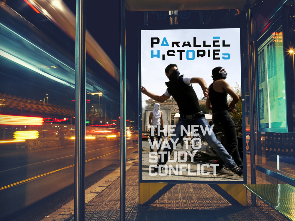
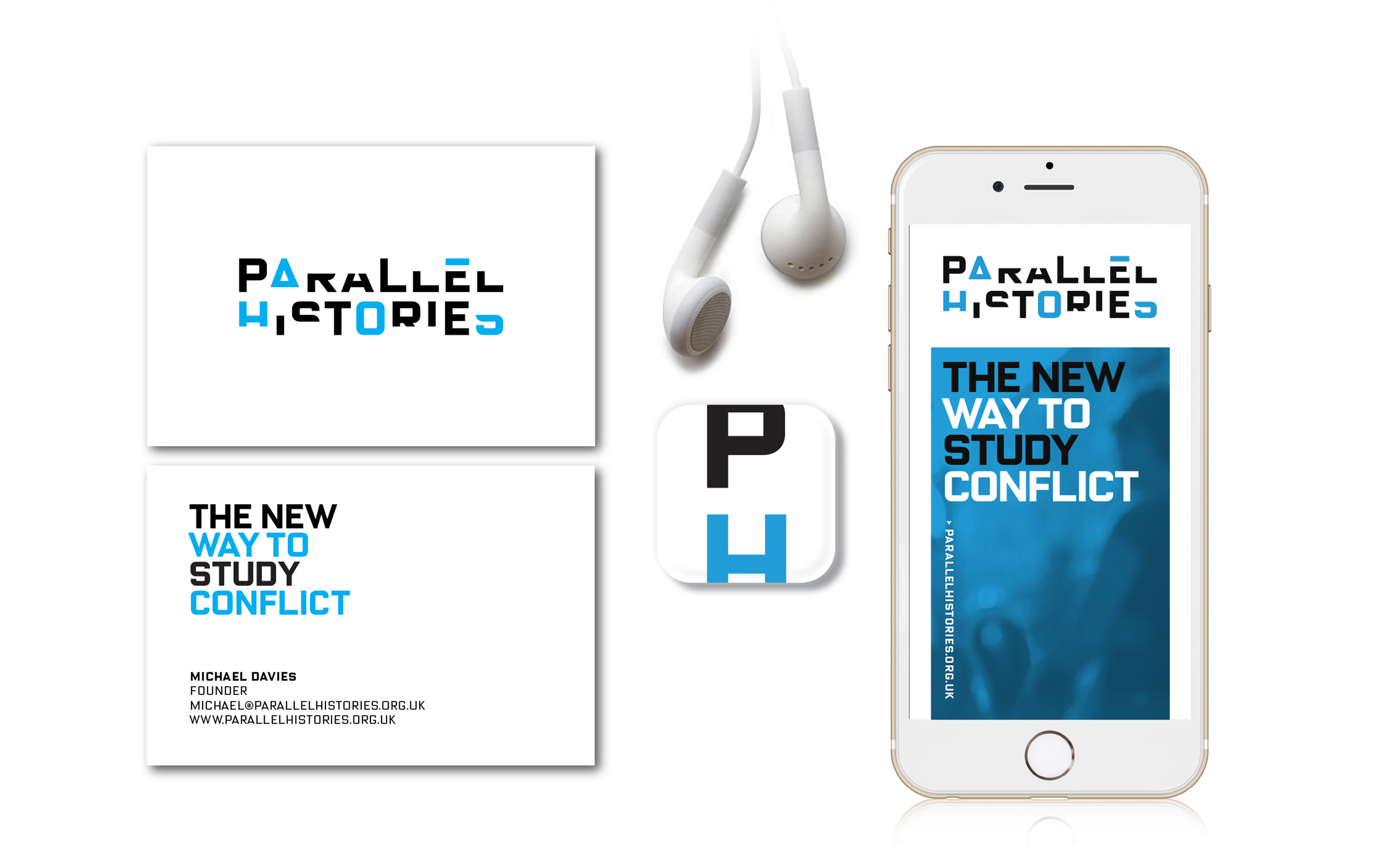
Parallel Histories is in learning program designed to present global conflicts in a balanced way.
Too often competing perspectives are twisted into a single, compromised narrative. Parallel Histories presents each view side by side, so that each can be examined fairly. It’s the new way to study conflict — accessible, balanced and parallel.
The ‘deconstructed’ brandmark communicates the way that history is reframed and rebuilt. The visual design communicates detailed information in an elegantly simple but compelling way.
Brandmark
Website
eBooks
Website
eBooks